LinkedIn Carousels: Document Posts That Get Saves
Learn LinkedIn carousel strategy for creators in 2026: document post structure, B2B slide design, caption line breaks, weekly workflow.

Disclosure: Independent guide from Fuxux. We are not affiliated with the platforms or third-party tools mentioned in this article. Product names belong to their owners.
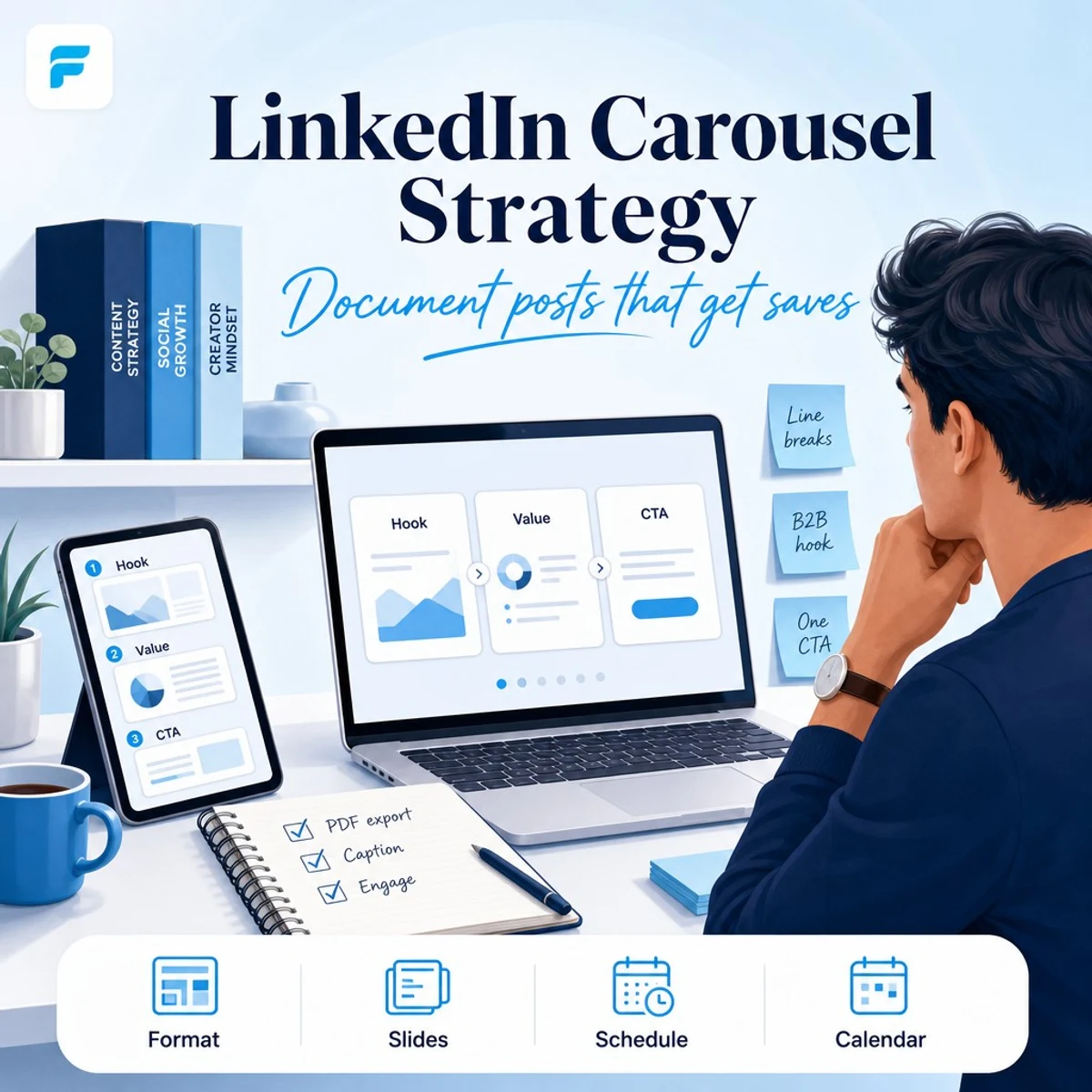
A LinkedIn carousel strategy is how you turn one professional idea into a swipeable document post people read, save, and share in the feed. On LinkedIn, carousels usually appear as PDF document posts or multi-slide uploads—mini playbooks, frameworks, mistake lists, and case studies built for mobile scrolling.
In 2026, LinkedIn carousels still reward clarity over decoration. The posts that perform tend to open with a specific promise, use one idea per slide, keep text large enough to read on a phone, and end with a comment-friendly CTA. If you already publish on Instagram, the thinking is similar—but the tone, pacing, and formatting need a B2B polish.
Pair this guide with Instagram carousel strategy, LinkedIn post not getting impressions, and LinkedIn scheduling so slides, copy, and publish timing work together.
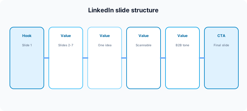
Quick answer: plan LinkedIn carousels around one professional outcome per post. Use slide 1 as the hook, slides 2–8 for scannable value, and the last slide for a single CTA. Format captions with line breaks, run an approval check, then schedule or publish when your audience is active on weekdays.
What is a LinkedIn carousel strategy?
A LinkedIn carousel strategy is your repeatable plan for creating, designing, captioning, and publishing document-style posts on LinkedIn. It covers topic choice, slide count, PDF layout, opening lines, hashtags, CTA, and how you measure impressions, saves, and comments.
LinkedIn carousels work when your audience wants a fast professional lesson: a framework, a hiring mistake list, a founder teardown, a product walkthrough, or a step-by-step tutorial. They fail when every slide is dense paragraphs, the first slide is a logo with no promise, or the post reads like a pasted blog article without line breaks.
| Carousel type | Best for | Typical slide count |
|---|---|---|
| Framework / how-to | Founders, consultants, operators | 6–10 slides |
| Mistake list / audit | Thought leadership, lead gen | 5–8 slides |
| Case study | Agencies, SaaS, services | 7–12 slides |
| Data or benchmark post | B2B brands with proof | 4–7 slides |
| Product or feature tour | Launches, demos | 5–8 slides |
LinkedIn document posts vs other formats
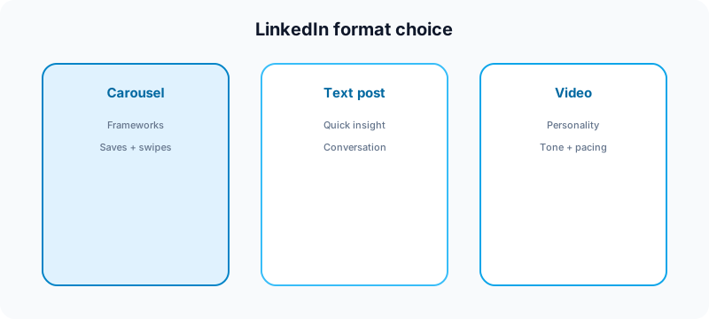
LinkedIn gives every format a different job. Text posts win speed and conversation. Video wins personality. Newsletters win depth. Document carousels win structured teaching in the feed.
Use a LinkedIn carousel when:
- The idea needs multiple screens to make sense.
- You want saves and swipe-through depth, not just a quick like.
- You are teaching a process with numbered steps.
- You have screenshots, charts, or examples worth swiping.
- You want a post that keeps performing after the first hour.
Use a short text post instead when one sharp insight is enough. Use video when tone and pacing carry the idea. If impressions are flat across formats, read why your LinkedIn post is not getting impressions before you blame the carousel format.
The slide structure that gets swipes
Most weak LinkedIn carousels fail on slide one. Professionals decide in one second whether to swipe. Your first slide should name the outcome, tension, or promise—not your company logo on a blank gradient.
Slide 1: Hook
State the problem, result, or curiosity gap. Examples: "5 posting mistakes killing your LinkedIn reach," "The carousel template I use every week," or "What I would do if I restarted my founder brand today."
Slides 2–8: Value
One idea per slide. Use short headlines, bullets, or numbered steps. LinkedIn readers skim vertically—if a slide needs a paragraph, split it. Keep contrast high and fonts large enough to read without zooming.
Final slide: CTA
Tell people what to do next: save the post, comment a keyword, visit your link, try a free tool, or read a longer guide. One CTA beats three competing asks.
Design rules for readable LinkedIn carousels
Design is part of strategy. A polished carousel that nobody can read on a phone is still a bad carousel.
- One focal point per slide. Do not crowd the frame with charts and paragraphs.
- Large type. Body text should be bigger than you think—mobile dominates LinkedIn consumption.
- Consistent margins and colors. Repetition builds recognition. See social media aesthetic for visual consistency tips.
- High contrast. Light gray text on pale backgrounds fails fast in bright offices and on commutes.
- Export as PDF when needed. Many creators design in slides or design tools, then export a clean PDF for LinkedIn's document uploader.
- Preview slide one as a thumbnail. It must work as the feed cover before anyone swipes.
If you are adapting an Instagram carousel, do not copy the same visual density. LinkedIn audiences often expect slightly more whitespace and a more direct professional headline. Use the free Instagram carousel splitter only when you are repurposing visual assets—not when you need a native LinkedIn layout from scratch.
Caption strategy for LinkedIn carousels
The caption should not repeat every slide word for word. Its job is to add context, credibility, and a reason to engage.
A solid LinkedIn carousel caption usually includes:
- A first line that works before "see more" expands.
- One sentence on who the post is for (founders, marketers, job seekers, etc.).
- A light summary of what swipers will learn.
- Line breaks between ideas—LinkedIn rewards scannable copy.
- A question or CTA that matches the final slide.
- Three to five relevant hashtags, not a block of irrelevant tags.
Format long captions with the free LinkedIn text formatter before you paste into the composer. For AI drafts you can edit in your own voice, start with AI caption writing for social media, then tighten the tone for LinkedIn.
How many slides should you use on LinkedIn?
There is no magic number—only a readability limit. Most educational LinkedIn carousels perform well between six and ten slides. Shorter proof posts can use four or five. Longer audits can go up to twelve if every slide earns its place.
| Slide count | When it works | Risk |
|---|---|---|
| 4–5 slides | Quick tips, one framework | May feel thin if the topic needs proof |
| 6–8 slides | Most how-tos and mistake lists | Sweet spot for mobile swiping |
| 9–12 slides | Case studies, deep audits | Drop-off if middle slides repeat ideas |
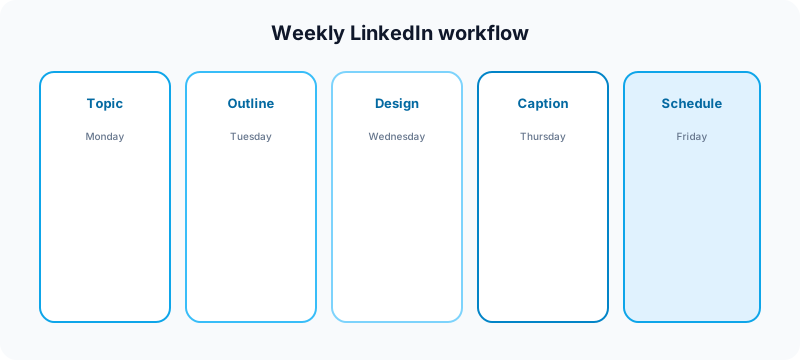
Weekly workflow for LinkedIn carousels
Creators who publish carousels consistently usually batch. They do not design a ten-slide PDF from scratch every morning.
- Monday: pick one professional topic from your content pillars.
- Tuesday: outline slides (hook, bullets, CTA) in a doc or slide deck.
- Wednesday: design slides with large type and consistent branding.
- Thursday: draft and format the caption with line breaks.
- Friday: run approval review, export PDF, schedule or publish.
- After publish: reply to early comments within the first hour.
For calendar planning, use content calendar guide for creators and how often to post on social media in 2026. For cross-platform adaptation, read how to cross-post to multiple platforms.
Repurposing Instagram carousels for LinkedIn
One outline can travel across networks—the wrapper should change.
- Headline: make the promise more professional and specific.
- Slide copy: cut casual slang; add context a LinkedIn reader expects.
- Caption: use line breaks and a clearer "who this is for" line.
- CTA: comment prompts and saves often work better than hard sells on slide one.
- Visuals: increase whitespace; reduce decorative elements that worked on Instagram.
Common repurposing paths:
- Instagram carousel → LinkedIn PDF document post
- Instagram carousel → LinkedIn text post with bullets (LinkedIn text formatter)
- Carousel outline → X thread or short-form video hook on TikTok
Scheduling LinkedIn carousels
You can schedule LinkedIn posts natively or through a multi-platform scheduler when you batch content for the week. Scheduling does not replace engagement—block time after publish to reply to comments and DMs triggered by the carousel.
Best practices for scheduled LinkedIn carousels:
- Queue on weekday mornings when B2B audiences are active (test your own analytics).
- Double-check the PDF export before upload—fonts and crops break easily.
- Run social media approval workflow if a client or teammate must sign off.
- Keep timezone and account selection correct in your scheduler.
See how to schedule social media posts for the full multi-platform rhythm.
Metrics that matter for LinkedIn carousels
Impressions alone are noisy. For carousels, watch:
- Impressions and members reached — top-of-funnel visibility.
- Engagement rate — comments, reposts, and reactions relative to reach.
- Saves — strong signal the slide deck was useful.
- Profile visits and follows — did the carousel grow your audience?
- Comment quality — are the right people responding?
If reach is low across post types, fix hooks and posting times before you redesign every slide. If reach is high but saves are low, tighten slide two through five—middle slides often lose swipers.
Common LinkedIn carousel mistakes
- Logo-first slide with no promise. Lead with the outcome.
- Wall-of-text slides. One idea per screen.
- Instagram tone on LinkedIn. Adapt voice, do not copy-paste.
- No line breaks in the caption. Format for mobile reading.
- Three CTAs on the last slide. Pick one next step.
- Publishing without replying. Early comments boost distribution.
- Ignoring PDF export issues. Always preview on phone before schedule.
Pre-publish checklist
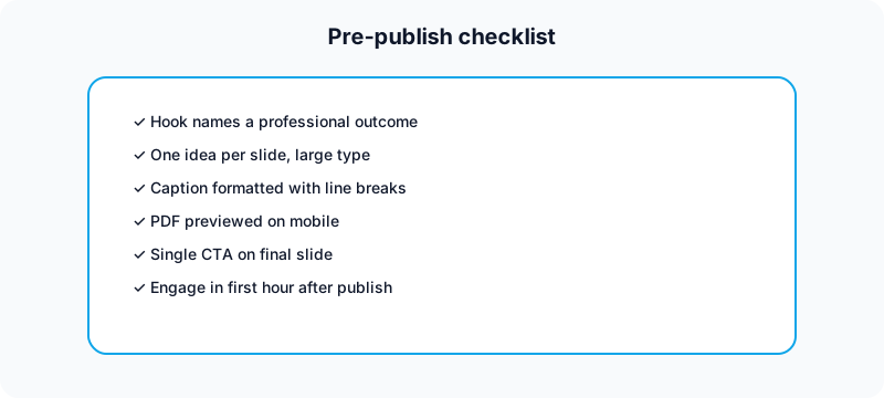
- Hook slide names a clear professional outcome
- Each slide has one scannable idea
- Caption formatted with line breaks
- PDF renders correctly on mobile
- One CTA on the final slide
- Hashtags relevant and limited
- Reminder set to engage after go-live
Free tools to support LinkedIn carousels
| Task | Free tool | How it helps |
|---|---|---|
| Format carousel captions | LinkedIn text formatter | Add line breaks and scannable spacing before publish. |
| Split wide visuals into slides | Instagram carousel splitter | Export slide dimensions when repurposing visual assets. |
| Plan weekly topics | Growth guide | Map pillars before you design the next carousel. |
| Draft hook-first captions | TikTok caption generator | Start with strong opening lines, then adapt for LinkedIn. |
| Package Shorts from carousel ideas | YouTube title checker | Turn carousel lessons into searchable Shorts titles. |
| Draft Shorts tags | YouTube tag generator | Support video repurposing from the same outline. |
| Plan Instagram grid | Instagram grid maker | Align cross-platform campaigns visually. |
| Check handle consistency | Instagram handle checker | Keep branding aligned across networks. |
| Check TikTok username fit | TikTok username checker | Match handles when repurposing to short-form video. |
Browse all nine utilities on the free tools page.
Related guides
- Instagram carousel strategy for creators
- LinkedIn post not getting impressions
- How to automate social media without looking robotic
- Social media best practices
- Can you schedule TikTok posts?
FAQ: LinkedIn carousel strategy
What is a LinkedIn carousel?
On LinkedIn, a carousel usually means a swipeable document post—often uploaded as a PDF—with multiple slides readers move through in the feed. It is a teaching format, not just a photo album.
How many slides should a LinkedIn carousel have?
Most educational carousels work best with six to ten slides. Shorter posts can use four or five. Longer case studies can go up to twelve if every slide adds value.
Are LinkedIn carousels good for impressions?
They can be—especially when slide one promises a clear outcome and the caption uses strong line breaks. If impressions are still low, fix hooks and posting times before you blame the format.
Should you repurpose Instagram carousels on LinkedIn?
Yes, but adapt headlines, tone, whitespace, and captions. The outline can travel; the packaging should change for a professional feed.
Can you schedule LinkedIn carousels?
Yes. Export your PDF, draft the caption, run your approval check, then schedule for a weekday window when your audience is active. Stay online after publish to reply to early comments.
Where a scheduler fits
Tools like this one help creators plan LinkedIn carousel weeks beside Instagram, TikTok, YouTube, and X: outline topics on a calendar, draft captions, format line breaks, review before publish, and schedule from one queue. Carousels take longer to make than text posts—but much easier when they are part of a batch system.
We are not affiliated with LinkedIn, Microsoft, Instagram, Meta, TikTok, or YouTube. Platform names are used to describe creator publishing workflows.
Bottom line
A strong LinkedIn carousel strategy is not about making more slides. It is about making each slide earn the next swipe with professional clarity. Start with one clear outcome, design for mobile readability, format your caption with line breaks, measure saves and comments, and batch the workflow so document posts become a regular format—not a monthly scramble.
Publishing to LinkedIn regularly? See how scheduling works for LinkedIn.
About the author
I build Fuxux, a scheduler that publishes to 14 platforms from one queue. I write about the parts of posting that are actually fiddly — what each platform will and won't let you schedule natively, where the API limits bite, and how to keep a queue running without babysitting it.
Ready to post smarter?
Fuxux handles the scheduling, the formatting, and the AI captions — so you can focus on ideas.
Start free — no credit card